|
|
|---|
Best Swedish homes as cool house design
Sweden is the largest country in Scandinavia and the fourth largest in Europe, bordering Norway and Finland, within the Arctic Circle.
Sweden has large numbers of newly built properties, with over 50% of apartment homes being built since 1960 with the majority being mainly rented. Freehold individual properties are largely owner occupied.
Official language is Swedish with a minority understanding Finnish.English is widely spoken.
Capital gains should not be charged for the sale of privately owned property.
There are no restrictions on Foreign Ownership.
Property and Real Estate Prices in Sweden
Range Varies, for example:
From around £25,000 / $37,000 for a single family home
From around £25,000 / $37,000 for an apartment
From around £40,000 / $60,000 for a villa
From around £50,000 / $75,000 for a bungalow
From around £85,000 / $125,000 for city homes
Country homes vary from around £150,000 / $225,000
Locations to buy real estate and property in Sweden
Stockholm being Sweden's capital is popular and including the suburbs represents about 20% of Sweden's total population and with the growth of financial and technical companies around Stockholm this will likely grow. It is situated on the Baltic Sea, at the entrance to Lake Malaren and is built on 14 islands with many exceptional waterside buildings.
Gothenburg, Sweden's second largest city on the West Coast of the country is a major port and industrial centre. Malmo, on the south coast is expected to grow significantly over the next few years following the completion of the 16 km bridge and tunnel linking to Copenhagen in Denmark.
Living Costs in Sweden
Sweden has enviable living standards supported by high tech capitalism and extensive welfare benefits.
Buying property and real estate in Sweden
It is usual for a Real Estate Agent to be used for buying and selling of property in Sweden. They will handle the necessary paperwork and communicate buying and selling prices with all parties involved.
It is not contractual to have your property valued but fairly common for buyers to hire independent surveyors.
When you have satisfied any questions in respect of your purchase a completion date can be agreed through your Real Estate Agent.
It is the responsibility of the buyer to apply for deeds of title within three months of the sale transfer and submit for registration.
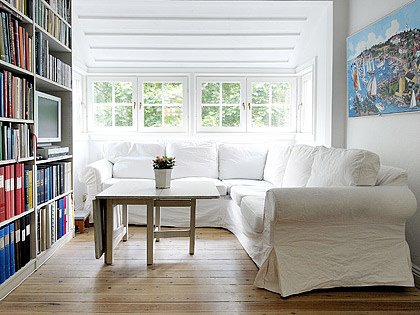
I found a couple of really great homes for sale on Stockholm real estate site Skeppsholmen. The first is a bit almost country/shabby chic, definitively Scandinavian and totally adorable.
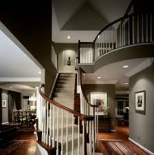
This flat is definitively on the more rustic side. The exposed beams, height of the ceilings and that floating walkway are to die for.
Best architecture Australian house in streets of Fitzroy


What you see above is a 4 bedrooms home that packs an intelligent design by combining a living area with a truly amazing backyard garden. Located on the streets of Fitzroy, an inner city suburb of Melbourne, even though it’s not wide it promotes open space to make it look bigger, and packs some modern furniture to get your eyes with. May not be the home of my dreams, but it sure has lots of key elements to charm me with.
Today I'm stalking the streets of Fitzroy, an inner city suburb of Melbourne (and perhaps my favourite area in that city). This is the architect's own home. Which architect the real estate agent neglects to tell us but we are informed it has 4 bedrooms, open plan living, indoor outdoor living and intelligent design. I love the sense of continuity between the living areas and the garden so important in Australian houses. It's a normal working day here in Australia but I know that the States are celebrating Thanksgiving (not a holiday we have here). I hope you all have a wonderful time with your family today but if you're a Thanksgiving orphan or all "familied" out then pop on over and join me later for a virtual drink in this backyard.
Sustainable building of NJIT Campus Center


The NJIT Campus Center and Academic Building create an intervention into the existing University fabric, uniting the Campus Green with the eastern edge of campus. A third floor pedestrian bridge connects the two buildings physically and creates a visual terminus for a pedestrian street. It also links the Academic Building with both a new roof terrace and a new exterior stair leading to the Campus Green.
The fundamentals of Sustainable Design call upon the core principles of the Architect's craft: the careful integration of buildings within their existing natural and cultural context; the creation of a satisfying interior environment and sense of place for the inhabitants; a rigorously efficient approach to the use of resources and its effect on building systems design; and the consideration of the future evolution and re-use of the built environment.
The integration of sustainable design principles within a project's overall solution continues to be a natural extension of the holistic, collaborative design approach which is the foundation of Gwathmey Siegel's work. Central to every one of our projects, this fundamental process enables us to develop solutions in partnership with our clients, allowing us to meet the varied goals of the program, function, aesthetics and sustainability.
Architectural elements, such as the consistent, careful inclusion of natural lighting and solar control elements, along with the sensitive selection of the interior materials and color palettes, contribute to the quality of the indoor environment for the users. Energy efficiencies, from the proper engineering of the building systems along with artificial lighting and control systems designs, are integrated through the inclusion of the expertise of various related disciplines, brought together at the start of the planning and design processes to contribute to a unified architectural solution.
Beautiful design for belair residence in California


The buildable site, an existing two-acre plateau, set sixty feet below the access road, affords panoramic views of Westwood, the Pacific Ocean, and the Canyon. The program, orientation, and topography provoked a composite courtyard parti that layers the site through the house, integrating the terraces and lawns.
On a two-acre plateau in Belair, California, the contemporary Belair Residence by Gwathmey Siegel & Associates Architects is a great mix of rounded shapes, amazing lighting and colors. Promoting open spaces, featuring wooden furniture in perfectly chosen places and an inverted cone that creates a contemporary focal point, we’re looking at an exquisite and tranquil home that many of us wouldn’t afford. The ground floor features a kitchen, a breakfast room and a glassed dining room, there are three children’s bedrooms and a games room at the first floor , while the top floor has the “creme de la creme”, a private guest suite and a massage room. Lovely, isn’t it?
Amazing minimalist home design


Minimalist style is based on the ideas that “less is more” meaning the less objects the better the space will look. Here is a spectacular list of 7 clean minimalist homes. Whether you like or dislike the minimalist style these homes should leave you calm and less stressful. 1. Casa C by architects Duilio Damilano 2. Garden and Sea by architect Takao Shiotsuka 3. Orr House by Swatt Architects 4. Woodside Bay Home by Hillery Priest Architecture 5. Openhouse by XTEN Architecture 6. Boso house by Kiyonobu Nakagame Architects
7. Somosaguas home by A-cero Architects This is a post from Home Design Find 7 Clean Minimalist Homes Related posts: Szirtes House by Chenchow Little Architects Remuera House Xten Open House
How to Create a Minimalist Home
There are actually no set steps to making your home minimalist, except to change your philosophy and shoot for the ideals in the previous section above. But here are some tips that I would offer to anyone trying to shoot for minimalism:
1. One room at a time. Unless you’re just moving into a place, it’s hard to simplify an entire house at once. Focus on one room, and let that be your center of calm. Use it to inspire you to simplify the next room, and the next. Then do the same outside!
2. Start with furniture. The biggest things in any room are the furniture, so you should always begin simplifying a room by looking at the furniture. The fewer pieces of furniture, the better (within reason, of course). Think of which furniture can be eliminated without sacrificing comfort and livability. Go for a few pieces of plain, simple furniture (example of a minimalist coffee table) with solid, subdued colors.
3. Only the essentials. Whether looking at your furniture or anything else in the room, ask yourself if the item is truly essential. If you can live without it, get it out. Try to strip the room down to its essentials — you can always add a few choice items beyond the essentials later.
4. Clear floors. Except for the furniture, your floors should be completely clear. Nothing should clutter the floor, nothing should be stacked, nothing should be stored on the floor. Once you’ve gotten your furniture down to the bare essentials, clear everything else on the floor — either donate it, trash it, or find a place for it out of sight.
5. Clear surfaces. Same thing with all flat surfaces. Don’t have anything on them, except one or two simple decorations (See Tip 9 below). Donate, trash or find an out-of-sight storage spot for everything else. It will make everything much, much more minimal-looking.
6. Clear walls. Some people hang all kinds of stuff on their walls. No can do in a minimalist home. Clear your walls except for one or two simple pieces of nice artwork (see Tip 8 below).
7. Store stuff out of sight. This has been mentioned in the above tips, but you should store everything you need out of sight, in drawers and cabinets. Bookshelves can be used to store books or DVDs or CDs, but shouldn’t have much else except a few simple decorations (not whole collections of things).
8. Declutter. If you are clearing flat surfaces and the floor, and storing stuff in cabinets and drawers, you’ll probably want to declutter your storage areas too. You can do this in a later stage if you want. See How to Declutter for more.
9. Simple artwork. To keep a room from being boring, you can put a simple painting, drawing or photo, framed with a subdued, solid color, on each wall if you want. Leave some walls bare if possible.
10. Simple decorations. As mentioned in the above tips, one or two simple decorations can serve as accents for a minimalist room. A vase of flowers or a small potted plant are two classic examples. If the rest of your room has subdued colors, your accents could use a bright color (such as red, or yellow) to draw the eye and give a plain room a splash of energy.
11. Plain window treatments. Bare windows, or simple, solid colored curtains, or simple, wooden blinds are good. Too much ornate stuff around the windows is clutter.
12. Plain patterns. Solid colors are best for floor coverings (if you have any), furniture, etc. Complex patterns, such as flowers or checkers, are visual clutter.
13. Subdued colors. As mentioned in Tip 9 above, you can have a splash of bright color in the room, but most of the room should be more subtle colors - white is classic minimalist, but really any solid colors that don’t stress the eyes is good (earth colors come to mind, such as blues, browns, tans, greens).
14. Edit and eliminate. When you’ve simplified a room, you can probably do more. Give it a couple of days, then look at everything with a fresh eye. What can be eliminated? Stored out of sight? What’s not essential? You can come back to each room every few months, and sometimes you’ll discover things you can simplify even more.
15. Place for everything. I’ve discussed this in other posts, but in a minimalist house, it’s important that you find a place for everything, and remember where those places are. Where does you blender go? Give it a spot, and stick with it. Aim for logical spots that are close to where the thing is used, to make things more efficient, but the key is to designate a spot.
16. Sit back, relax, and enjoy. Once you’ve simplified a room, take a moment to look around and enjoy it. It’s so peaceful and satisfying. This is the reward for your hard work. Ahhhh. So nice!
Beach Residence, Sullivan Island by Huff + Gooden Architects LLC


Located on a well-populated barrier island, the design breaks away from prevailing beach house typology and finds its clues for development in other ways.
Conceptually, the house created by Sullivan Island by Huff + Gooden Architects LLC consists of three parts: a latticed screen, a cube comprising the living area, and a linear bedroom/core element completing the composition.
The site is located in front of three WW2 bunkers. These sentinels have presided over this former military reservation for decades. The house continues this posture and resides near the edge of the beach providing both a reprieve from and connection to the beach beyond. The house is on axis with the bunkers and completes the formation as viewed from the beach.
Personal residence of Grant Kirkpatrick by KAA Design Group


The LA Times has a photo slideshow of this home in Manhattan Beach, California. The house is the personal residence of Grant Kirkpatrick, who is a principal of KAA Design Group in Los Angeles.
Small house in garden by the name of Archteam


I came across a Czech architecture company by the name of Archteam; their “House in the garden” is a small house, which is located on a long, narrow lot and I thought it could be a source of inspiration for narrow lot plan seekers.
The “House in the garden” is a small, two-story family house located about 270 km from Prague, in the quiet town of Kromeriz in southern Moravia. It was placed on a narrow, long lot with existing mature trees, which presented a challenge for the architects.
I love how this wood house is designed to work with the narrow lot and not against it - the long entrance wooden deck pathway leads to the house, its gallery spaces and glass walls.
It seems as if this small house design only enhances the characteristics of its narrow lot, as if it’s an integrated part of the garden and its large trees.
very modern house or avant garde architecture


New Urbanism tenets, applied to New Towns and other communities, are based on high density development giving over green space to the public good, a central business core with close by residential development, and restrictive covenants governing the styles of architecture prescribed.
In most cases, garages are relegated to rear alleys so as not to crowd the front elevations. Period features are based on regional styles. Some communities allow very modern or avant garde architecture, such as in Prospect, Colorado.
Most are based on traditional Colonial, Mediterranean, Victorian, Low Country, and Classical Revival styles.
Subscribe to:
Comments (Atom)
